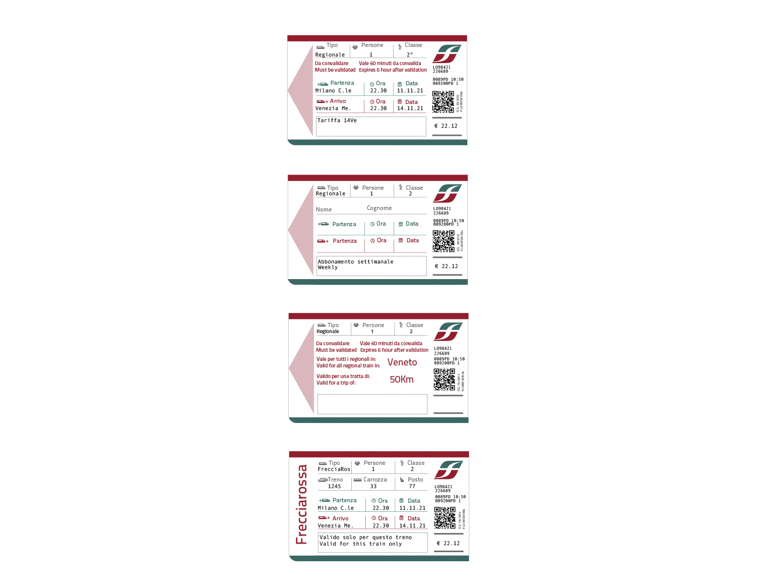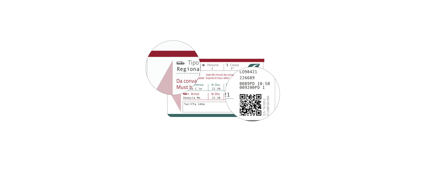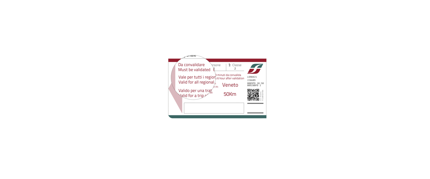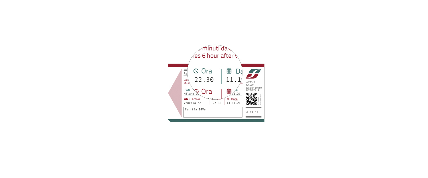
Trenitalia
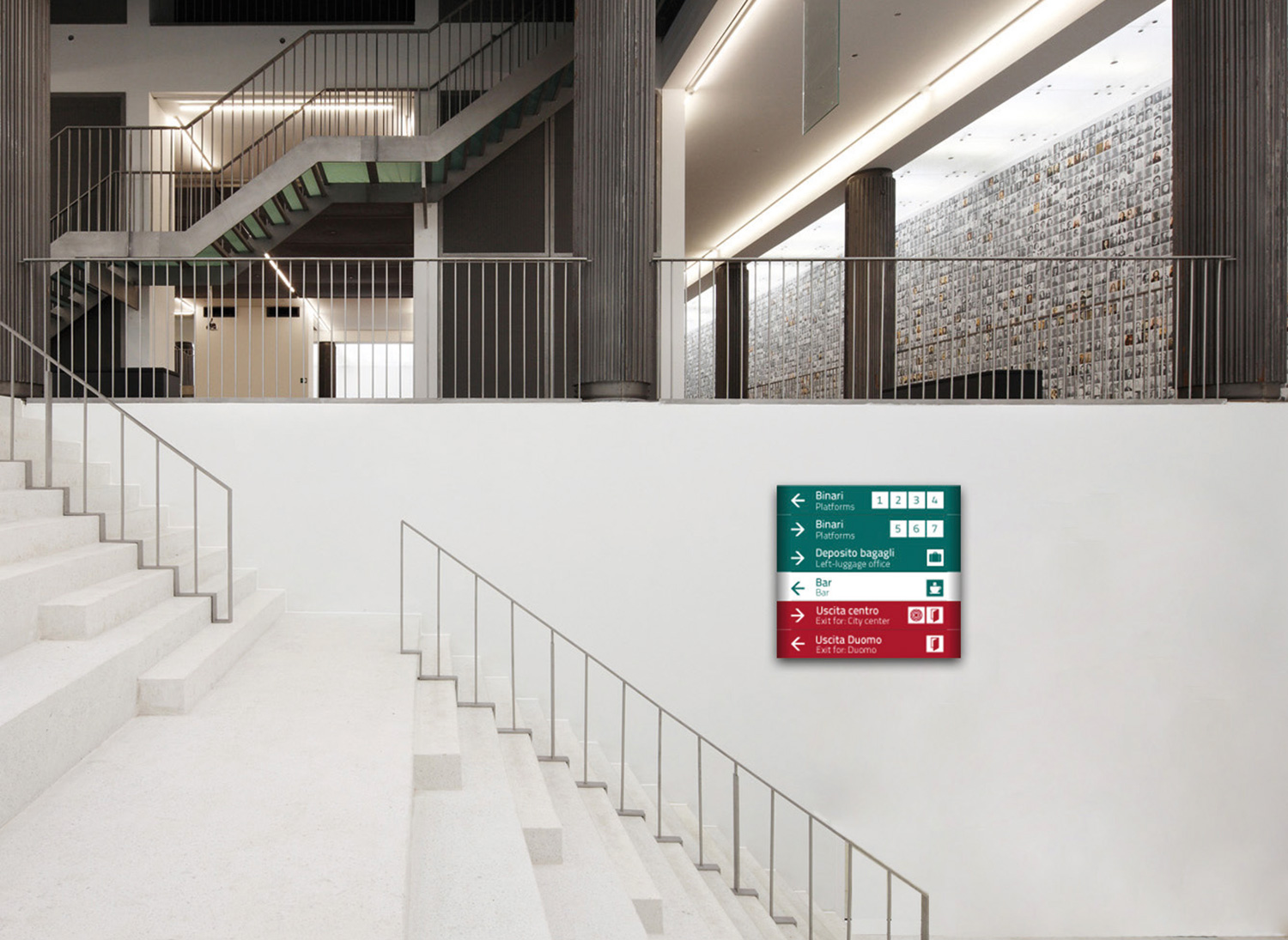
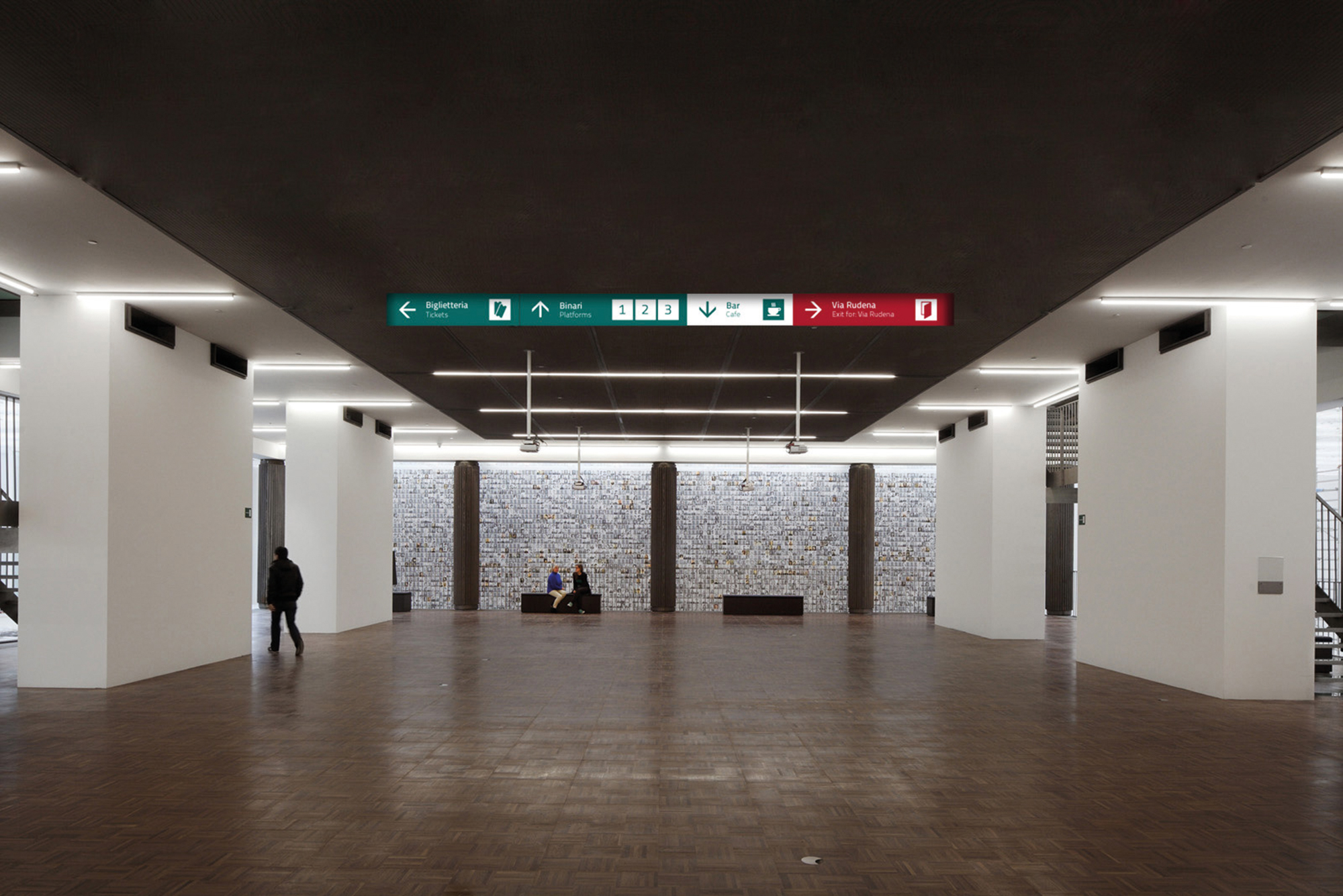
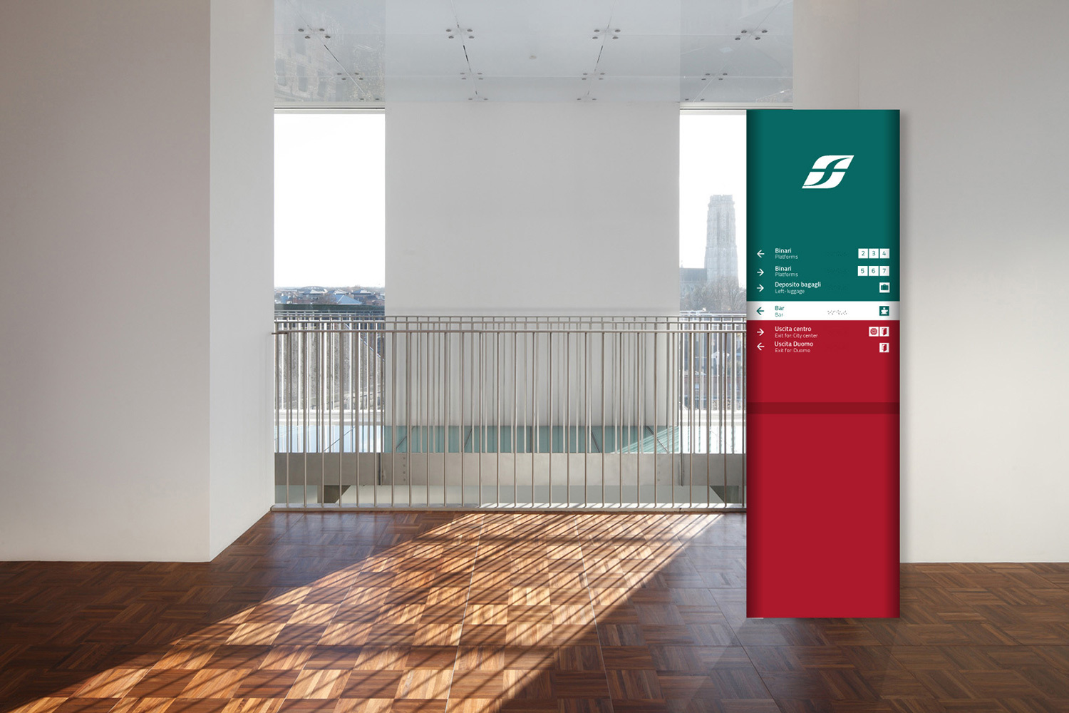
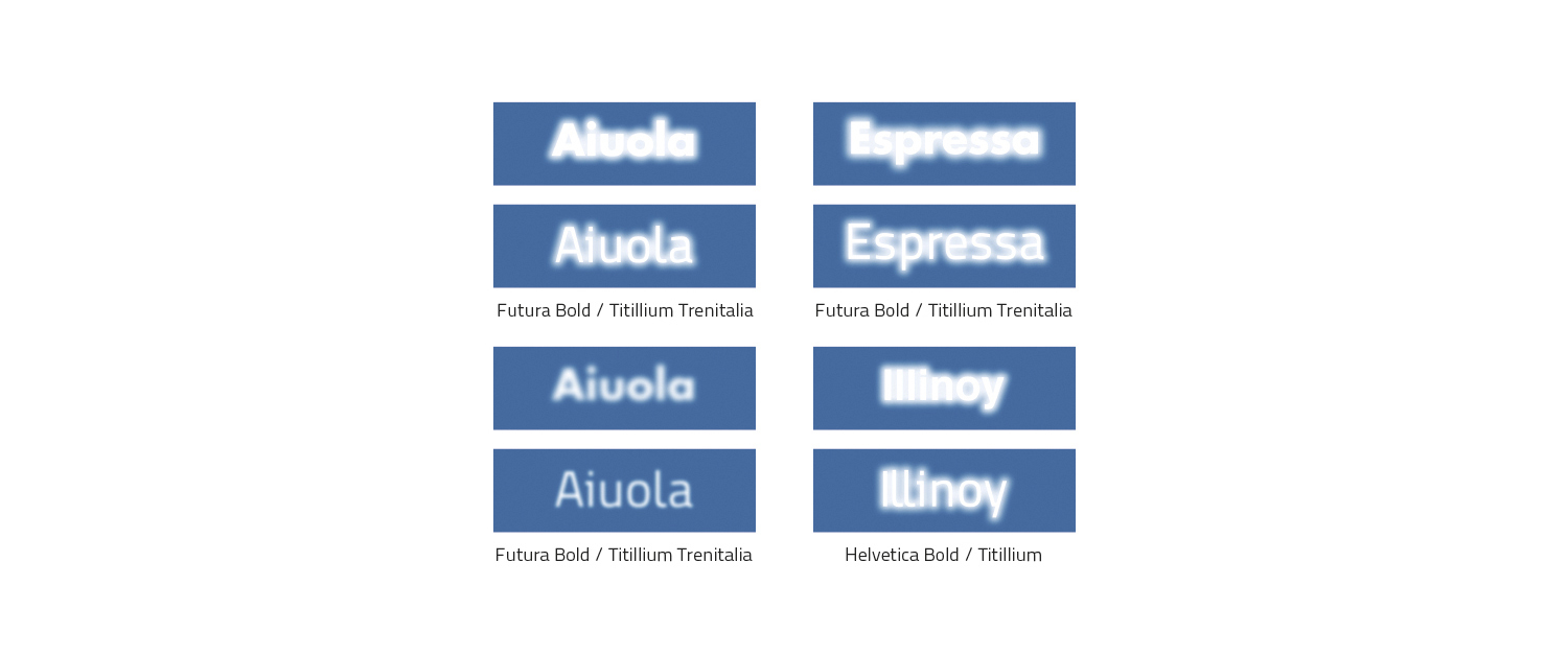
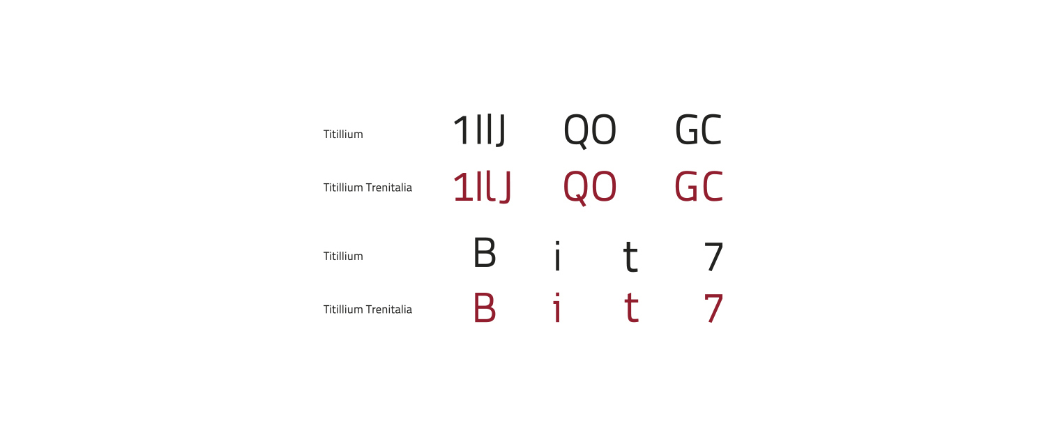
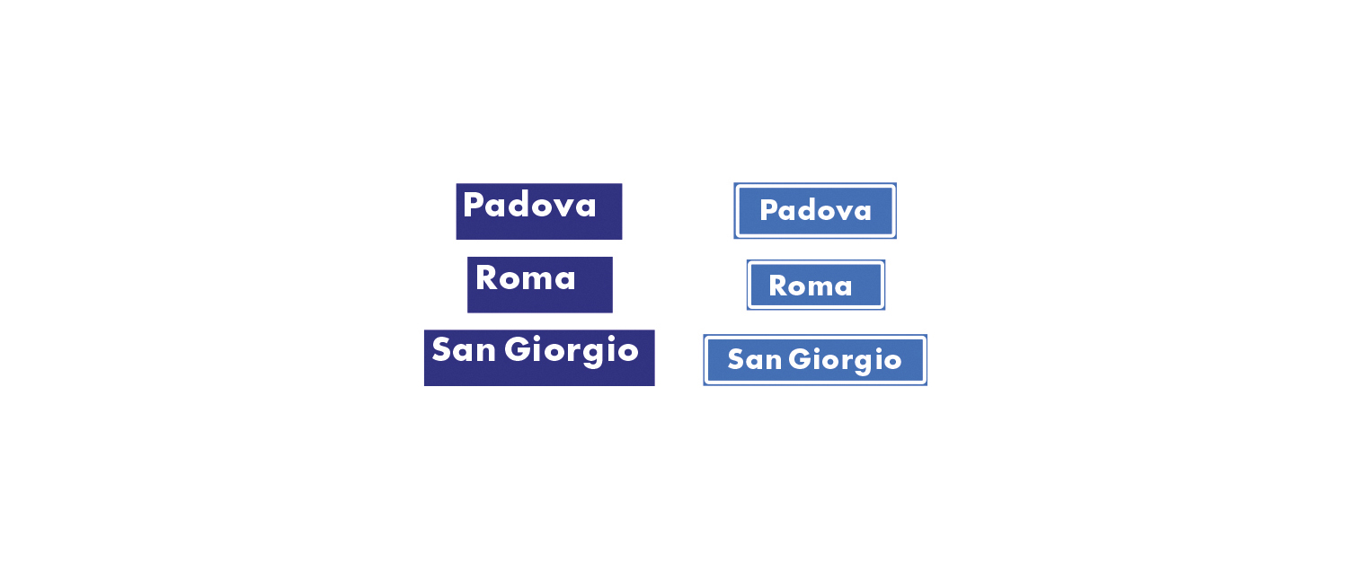
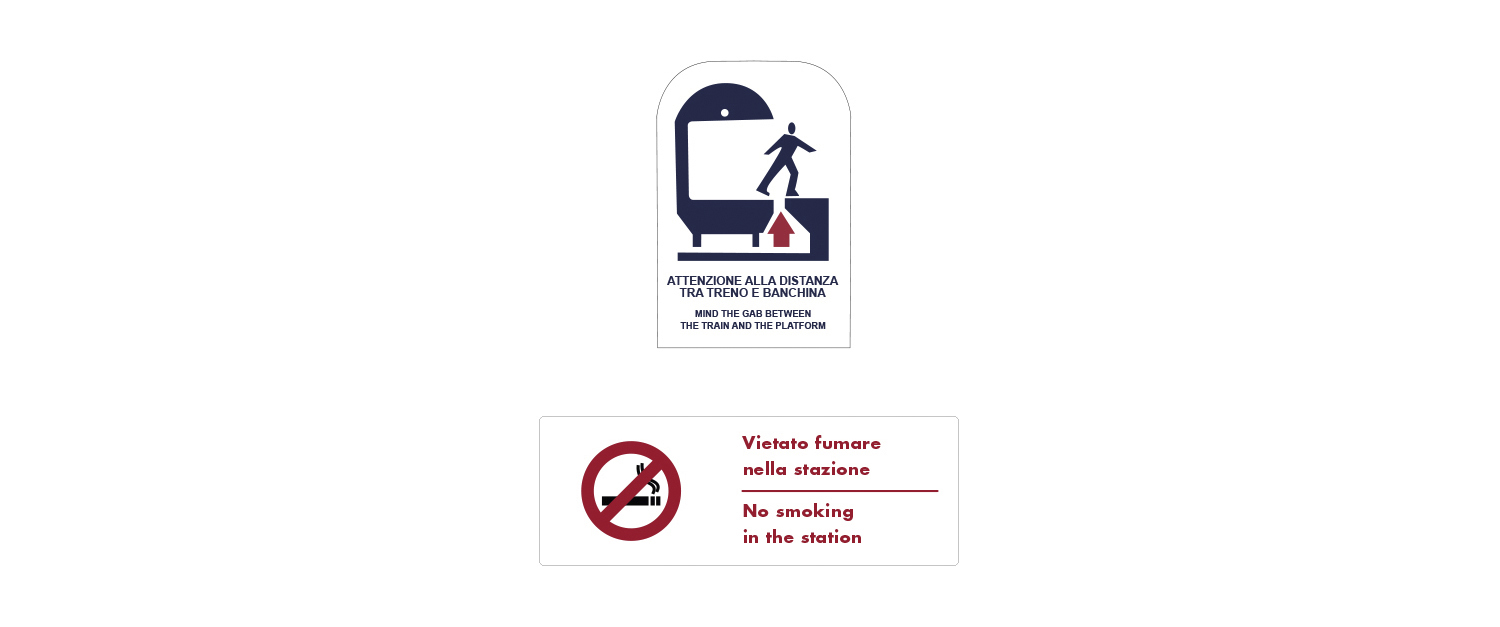
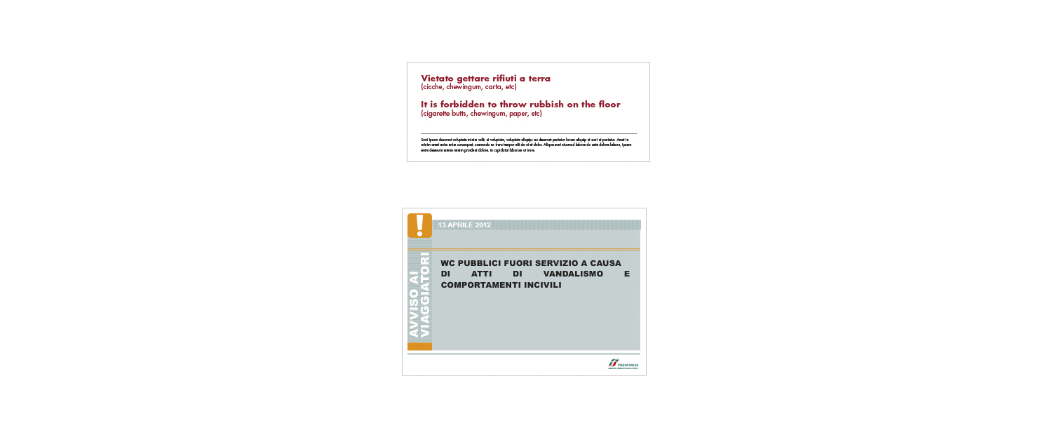
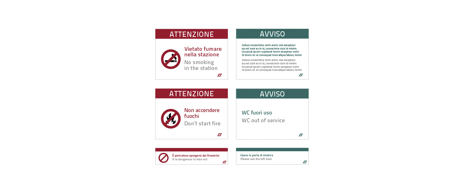
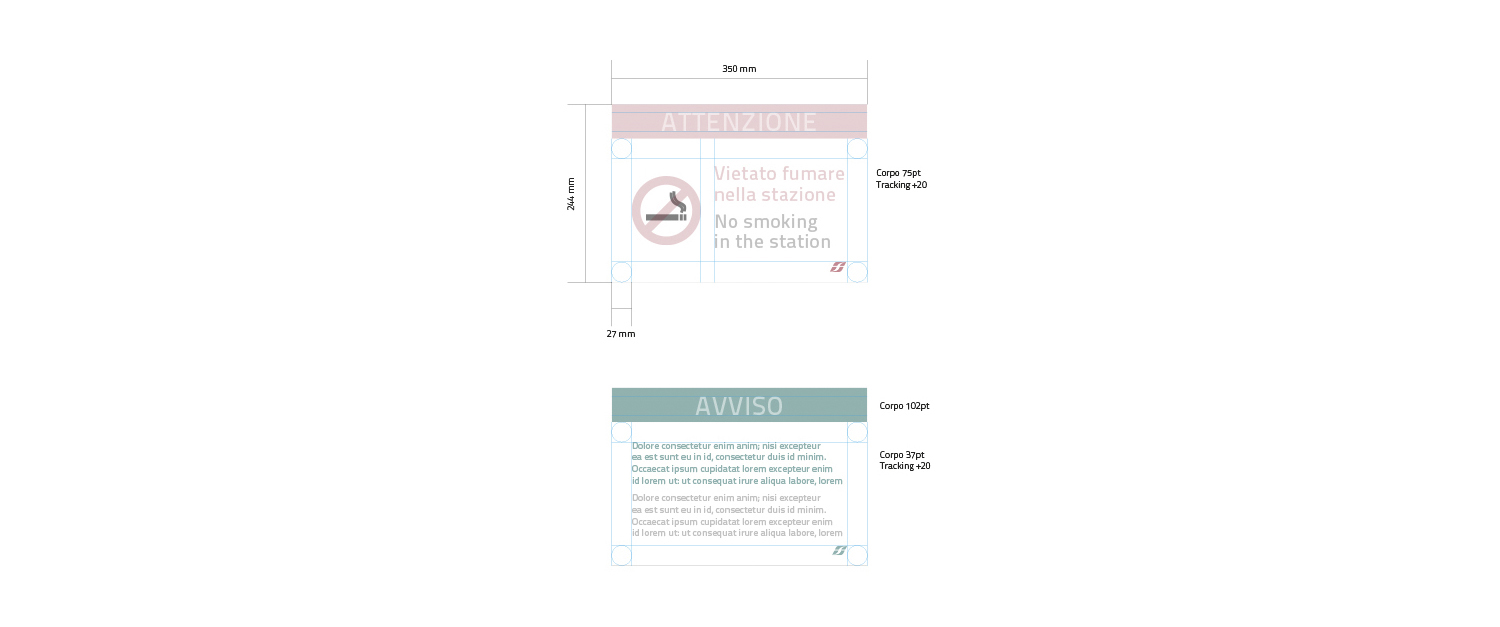
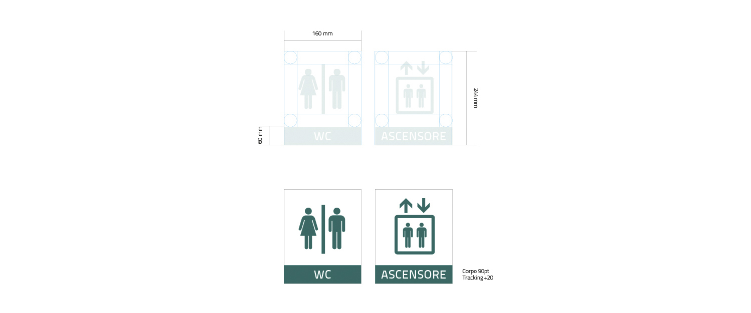
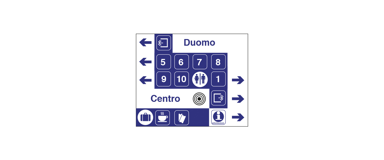
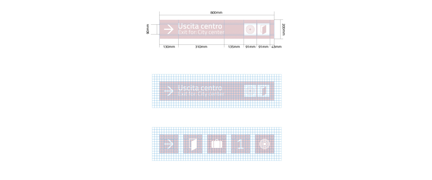
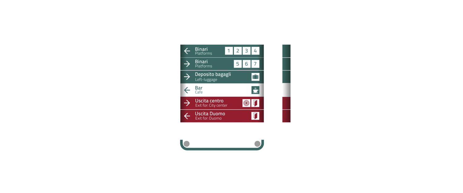
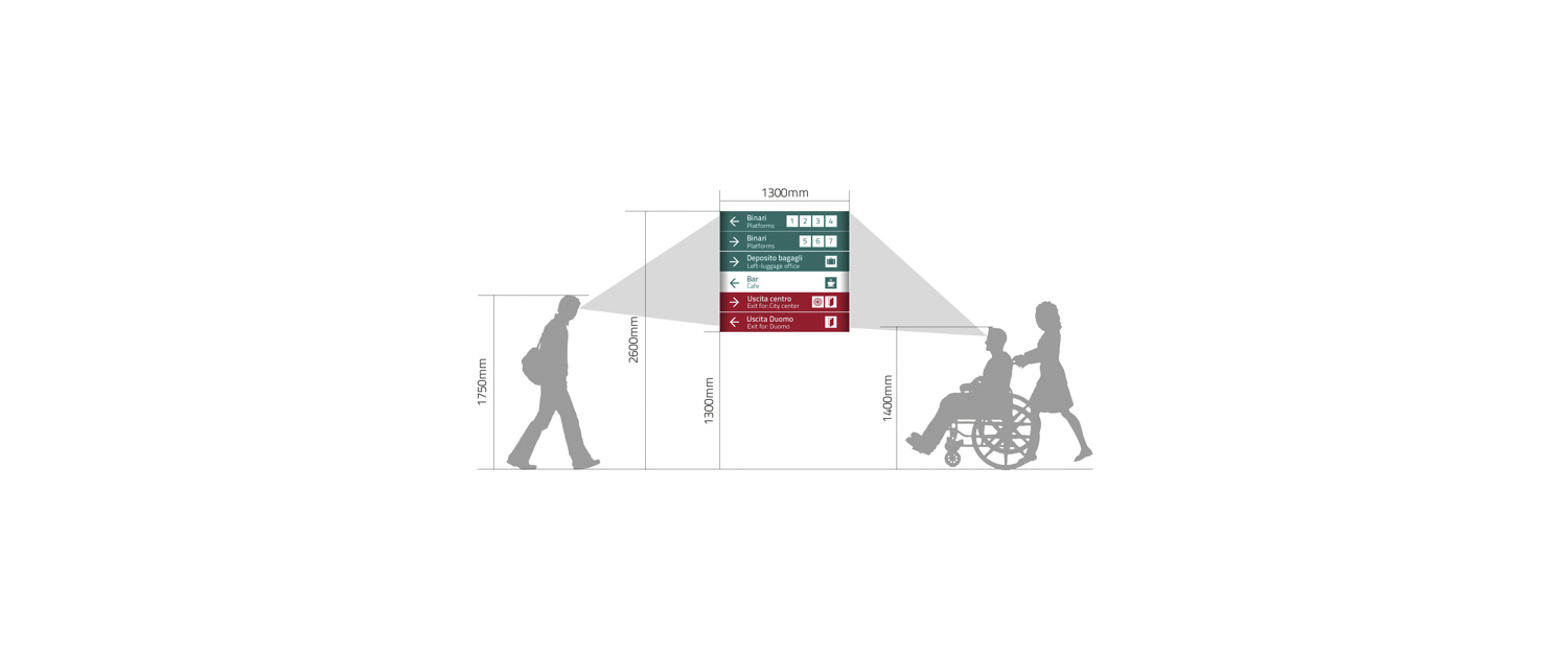
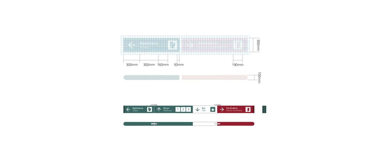
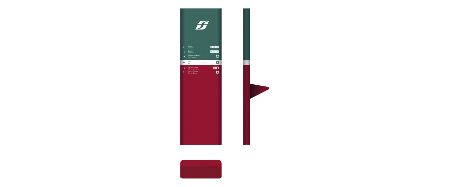
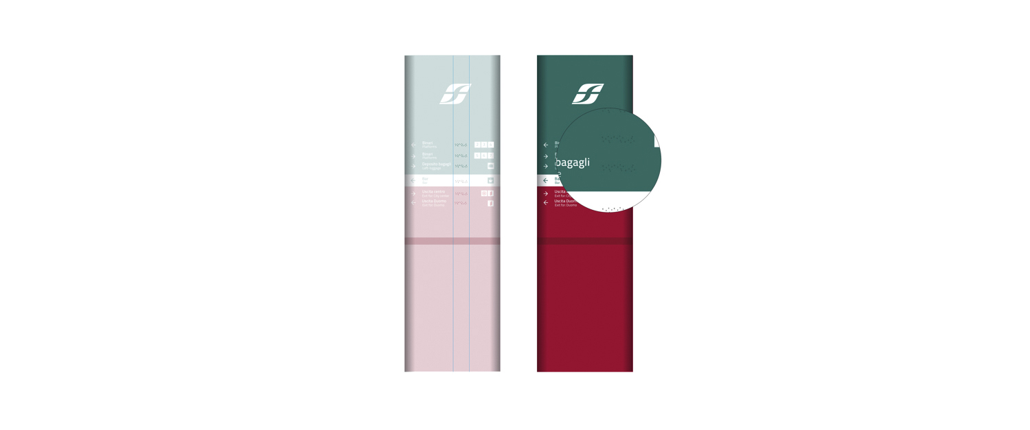
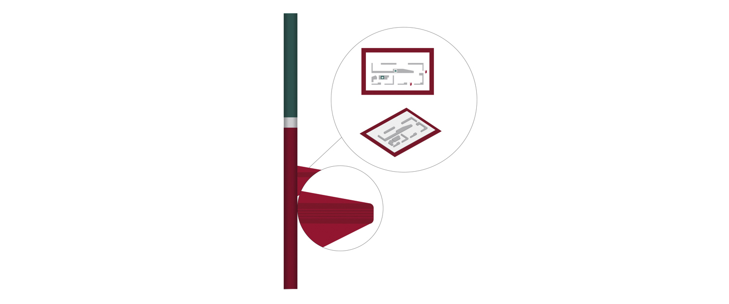
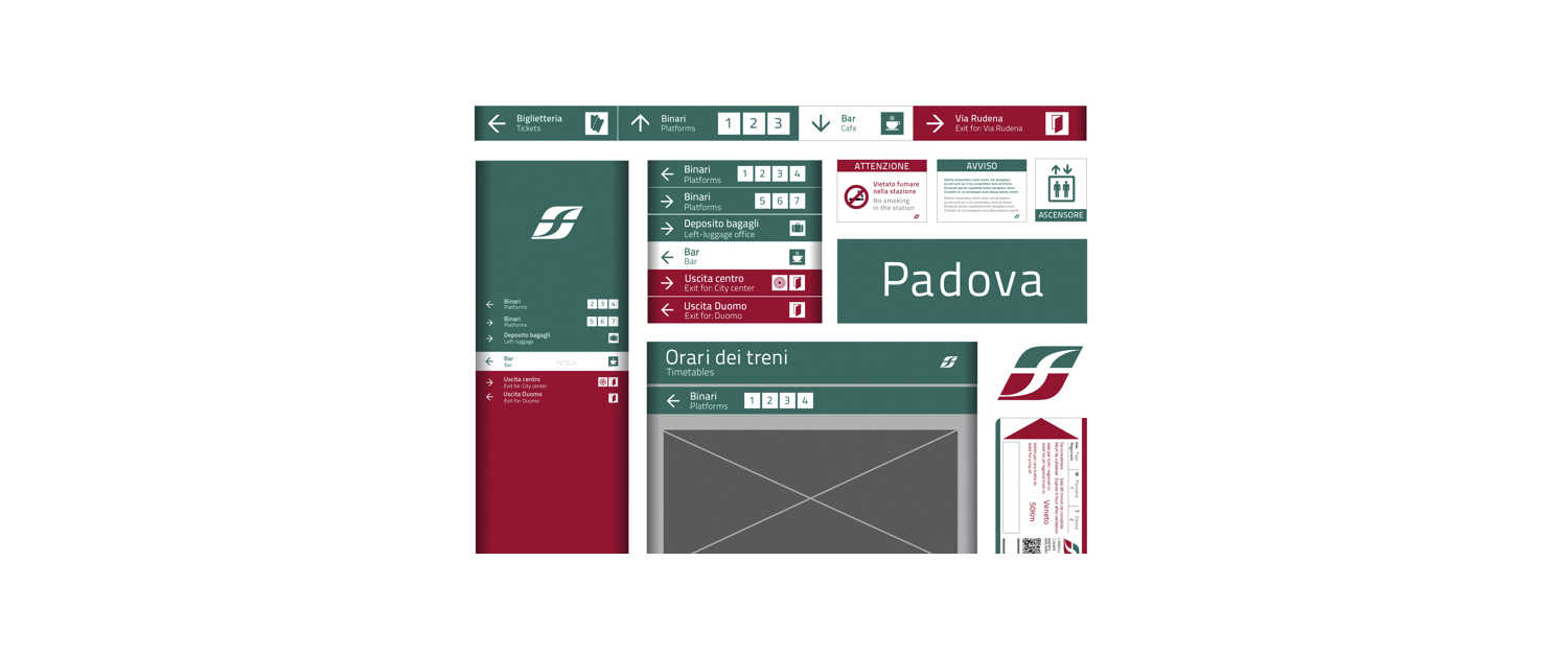
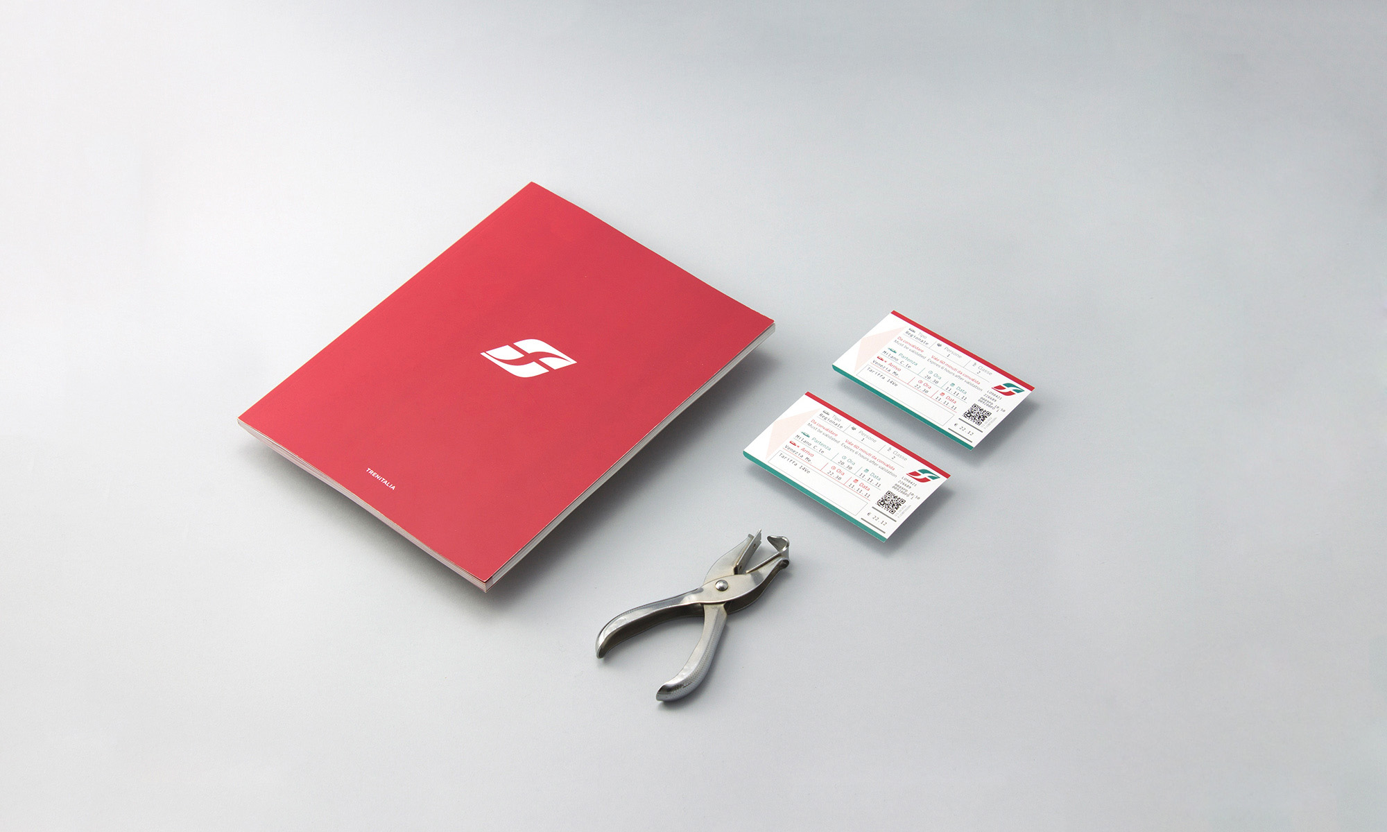
The actual wayfinding of Trenitalia has a incomplete and misleading signs, so this restyling designed by my studio between june and september 2013 must improve the users experience and create something useful for the amount of people that visit Italy every day. In this project there is a particular attentions to disadvantaged people (who use wheelchair or who is blind for example) so every panels or signs has something that helps the reading and also has a proper height from the floor. The use of colors is also important: the three colors chosen, that are the three colors of the italian flag and the company colors of Trenitalia, relates to precise directions. Green areas to take trains, white for generic directions like bar or shops and red to exit the stations. Every sign has a modular design, so every studio that in the future may change or add something will be facilitated. The font used for this restyling is the Titillium (an open source font made in italy), with a little bit changes that improves the legibility.